If you want to encourage citizens to tell their stories online, then you need to provide inclusive and welcoming community engagement experiences. The best community engagement websites set the tone for the rest of the online participation experience and there are a number of design techniques you can use to get citizens excited about shaping their future in a digital environment.
A positive user experience (UX) encourages community members to communicate their values and priorities. While it can be difficult to build trust in an online environment, applying some foundational design principles to your community engagement website will make your community feel safe to share their dreams and aspirations.
If you can put people first and think from the community’s perspective, then you can create engaging online experiences that capture attention and drive ongoing participation.
So, once you’ve chosen an online engagement platform that’s suitable for you and your team, you need to think about the front-end experience. It’s important to give your community a reason to keep coming back for more.
1. Enhance Usability
It’s important to design an inclusive website that many different groups of community members can engage with. To do that, you need to make sure that it’s easy to use and understand.
You can follow WCAG’s latest guidelines to ensure that the front-end design is easy and intuitive for a diverse range of people. For example, it’s important to use readable fonts and contrast to ensure that content is easily readable. You can also use translation tools to ensure that your online community platform can be read in different languages.
Web design might be outside of your day-to-day community engagement skillset, however, a good community engagement platform will have these features built in. Its design templates should maximize usability and allow you to tailor the look and feel to your community.
If you begin with the end game in mind, you can also design every engagement landing page in a way that makes it as easy as possible for citizens to provide valuable input. All of the functions on a high-performing community engagement website will also be intuitive and smooth. They won’t take visitors away from a page unnecessarily or behave in unexpected ways.
The online experience should also feel familiar and people in your community should be able to intuitively predict how to interact with your online participation tools.
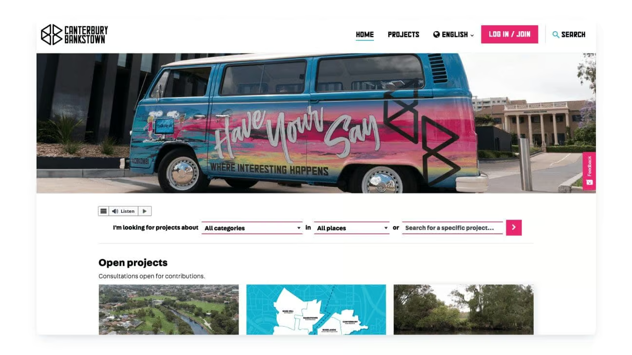
For example, The City of Canterbury Bankstown has created an inclusive community engagement website that gives every community member a fair go when it comes to having their say. The website can be translated into over 40 languages and can be easily adjusted so that it’s more user-friendly. With the click of a button, the content can be transformed to be dyslexia friendly, the text can be made bigger, the contrast can be turned up, and more.
2. Select the Right Tool for the Use Case
Are you trying to inform, involve, consult, or empower your community?
Do you need to prompt your participants to consider the local context of a place before they provide their feedback? Maybe you need to help them explore your concept visually before they can offer informed input.
It’s important that you use the right online public participation tools for the job across every page on your community engagement website. If you don’t have a versatile participation toolkit, then you might inadvertently exclude people or capture the wrong type of input.
So, make sure you think about your use case and the community context before you select the online public participation tools that you will use on your engagement website. If you use a wide variety of public participation tools, you can also cater to a wider range of learning and communication styles.
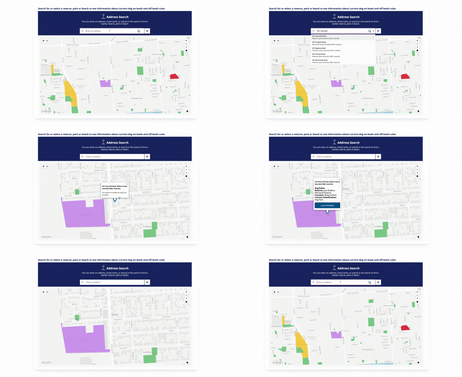
Take a look at how the City of Port Adelaide Enfield used an interactive map to select their favorite park or reserve before providing feedback on the dog on and off leash rules in the area. Participants could easily click on map areas to find the current rules so that their feedback was more targeted and the city received fantastic insights into the community’s preferences.
3. Capture Attention
Your community engagement platform should empower you to create impactful experiences that capture attention and drive participation. It’s also easier to build trust and confidence when your community engagement website looks professionally designed and matches your organization’s broader online presence.
A clean and simple design with plenty of white space is always a good starting point. From there, you can tailor the design aesthetic to your brand, community, and project.
Make sure you do your research about who is in your community and then create a design that will be appealing and welcoming for them. Consider what type of photos, illustrations, or artwork you could use to reflect the diversity of your participants.
You can also style your participation tools throughout the design process to ensure that they all fit seamlessly into the rest of your online engagement landing page.
The City of Melbourne’s Neighbourgood Portal artworks are a great example of how you can capture the community’s attention. The city developed custom illustrations for its dedicated neighborhood portals, ensuring that they were representative of its rich cultural heritage and diversity. The designs invite many community members to envision themselves in Melbourne’s future and as a result, they are more likely to engage.

4. Enhance Discoverability
You should make it as easy as possible for community members to find and contribute to projects that they care about. To make projects easily discoverable, you should sort your community engagement website into organized categories, topics, and regions.
If you’re running multiple projects, you can also tag them according to interest areas to make them more discoverable. You could even think about setting up designated landing pages for specific topics or focus areas, or embedding “follow” or “subscribe” functions that allow citizens to receive project updates.
It’s also important that key pages or participation tools aren’t hidden beneath convoluted menus. Navigating your community engagement website should be quick, painless, and logical.
Melbourne Water encourages its community to work together to make Melbourne a great place to live and hosts a lot of projects on its dedicated community engagement website. To make it easier for community members to find projects of interest, they have implemented a robust filtering mechanism and search bar at the top of their home page. This enables citizens to search for projects that align with their interests in specific locations.

5. Create an Emotional Connection
It’s important to be factual. However, you can encourage your community to participate in your project by creating an emotional connection with every website visitor.
Think about what information is most relevant to your citizens and communicate it in your website copy, videos, or imagery.
Your role is to help people understand why your work is important and you can overcome complacency by contextualising the facts for them.
Tell a story about how this initiative will impact the community and people’s daily lives. You can still create an emotional connection with your community and inspire your citizens while ensuring that all information you share is factual.
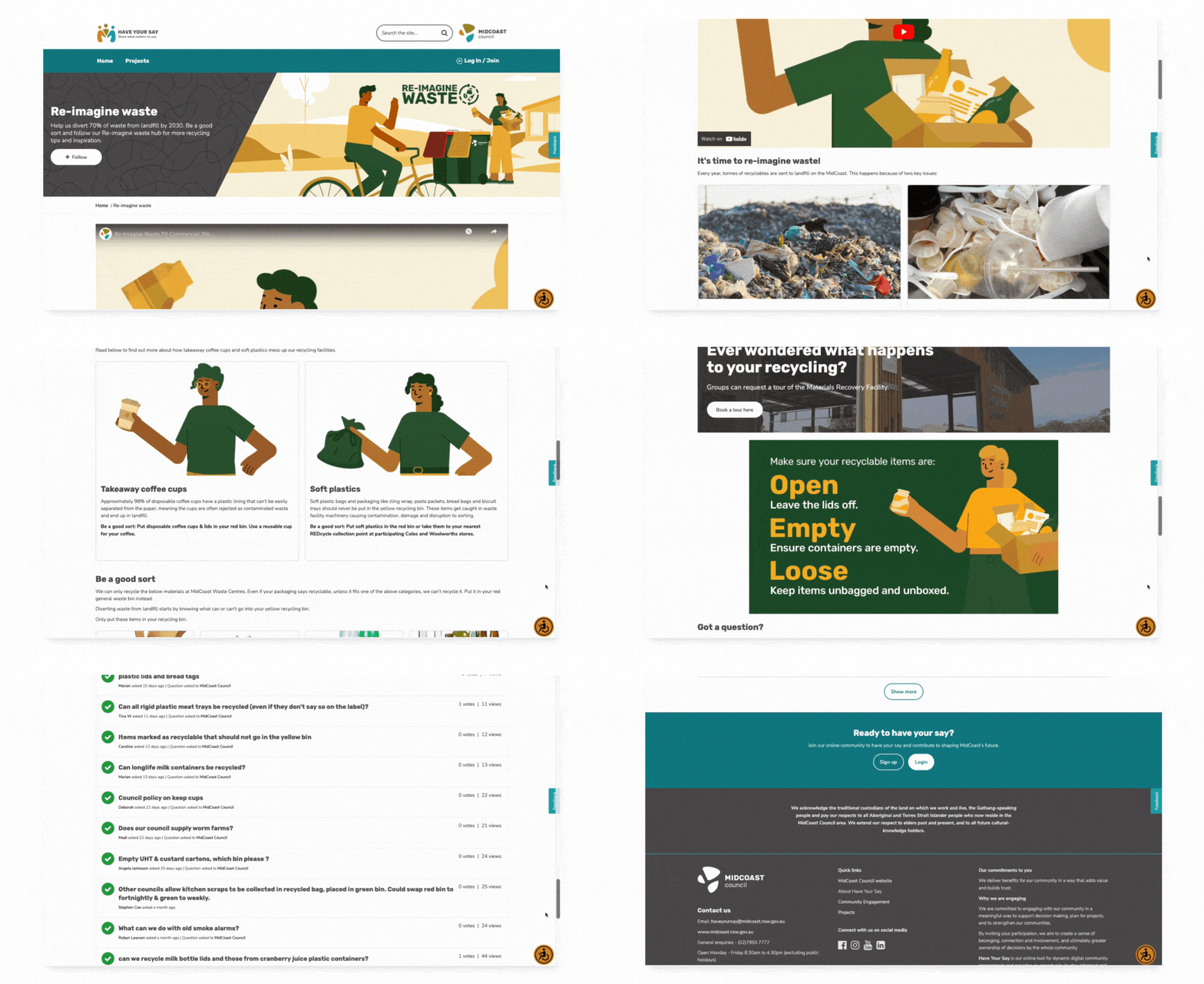
MidCoast Council encourages the community to “be a good sort” in its Re-Imagine Waste online hub, which is dedicated to sharing recycling tips and inspiration with the community. It has an educational video and practical tips that highlight the problem of recycling contamination and clearly explains what each community member can do to reduce landfill on the MidCoast.
Give Your Community Something to Care About
Your community engagement website should be a dedicated space for public participation that your community can constantly come back to. If you want citizens to play an ongoing role in shaping their local area, then you should leverage these foundational design philosophies to keep them coming back for more.
When you put user experience first, you are more likely to create a valuable, inclusive, and welcoming online experience. You can drive repeat visits to your community website, gather representative insights, and build trust.


